On the 13th of December, after school, Daniel and I stayed behind to film some test footage of the D.T. room and the English corridor so that we had an idea of how we could film and where actors needed to be positioned for the best results. We found that the D.T. room was the perfect place to film the Girl scenes, as it had big industrial doors and looked like an abandoned warehouse or factory of some sort - the kind of effect we wanted for these scenes. We were pleased to see that there was a place where the Girl could be positioned where, when the doors were slid back, a crack of light would illuminate half her face, as specified in the storyboard. There was also a good section of the ceiling where we could tape a torch for the effect of a swinging light bulb. With all of this in mind Daniel began to take pictures for reference, such as the clothes I would be wearing, where the stool and torch would be placed, the doors... he then filmed me opening the doors and the effect that they create of my face when I am sat on the stool.
On the 15th we began to look at film posters and film magazine covers to help us to create our own. As a class we criticized each others drawn out drafts and left post-its with good and bad feedback so that we can work on them and meet specifications. We received all good feedback from our film magazine cover with no areas where we needed to improve which pleased us and our teacher. However there were a couple of things that needed improving on for our film poster - it needed an age rating, producer information, newspaper reviews and when it is coming out to appear on it. So I made these changes swiftly; remembering my target audience being 15-25+, I put the age rating as a 15. I then added 'coming soon' and 'from the producers of...' on it and made up some reviews from The Times newspaper and Total Film magazine.
After this exercise we looked at some professional film posters and magazine covers. The posters were for "McGruber", "Crazy Heart" and "Never Let Me Go". We analysed them as a class, noticing that "McGruber" was an action comedy as there was a rather large explosion in the background and each character had a mock 'serious' face. The title suggested that the film was a spoof of well-known action programme "McGyver", and spoofs tend to try and be funny. We said that "Crazy Heart" was probably a feel good country and western themed film about a man and his love for music, as there was an old man with a guitar and the font for the title was in a font that if often used on Cowboy films. Therefore the film had no age rating on the poster as it wouldn't appeal to a younger audience anyway. "Never Let Me Go" had the appearance of a romance film as the colours were all black, red and white which is conventional of this style of film. Keira Knightly's award was advertised under her name on the cover to show people that she is a very good actress, therefore this is a serious film with good acting involved. We knew that it wasn't a Romantic Comedy, as there were no smiles or laughing on the cover. All characters looked either serious or sad.
We looked at some issues of Total Film and Empire. We saw how each main image was central and mostly had direct mode of address. The conventions of the magazine were sometimes subverted in order to fit with the genre of the film in the main image, for example, when 'Inception' was the main image, the subtitles and surrounding text was given the effect of being sucked into the centre of the magazine. The conventional colours seemed to be red, white and black with the occasional blue. The title of the magazine is always in the top left corner and the bar code in the bottom right corner.
When school had finished, Daniel and I came back at around 5 'o' clock to begin some filming. I got changed into the clothes of my character - baggy, scruffy jeans and a plain white t-shirt - and put on some eye liner and mascara to smudge down my face to give the effect that I have been crying. I then back combed my hair to make it look incredibly messy. We went to the D.T. room and my feet were duck taped to a stool that I was sat on, and some duck tape was placed around my mouth to be used as the gag. I was the Girl, and ready to be filmed. Some string was placed on our torch which was then taped above my head but out of shot so that it looked like a swinging light bulb above me. Daniel used his camera to film me acting distraught with the help of extra lighting from Russell Shaw and Ashley Pitt who used other torches and their phones. Daniel filmed a close up, mid shot, long shot, high angle shot and panning shot using a trolley. All these shots were repeated at least twice so that when it comes to editing, we can pick the best take. After these shots were done, we went to the English corridor to do some test footage how to film the Magician walking using Russell Shaw's feet as our real actor was unavailable. We realised that a skateboard would need to be used to give the effect that the camera is following the Magicians feet, otherwise the camera is too shaky and it looks unprofessional.
On the 16th Dec, we filmed some of the Magicians scenes before our classes begun. Because we only had a top hat and blazer available at this time, we said that this would simply be test footage. We only filmed Scott as the Magician opening the big industrial doors. We filmed his face in a close up and then a mid shot from the back so that we didn't get any incorrect mise-en-scene into the frame.
Thursday, 15 December 2011
Thursday, 8 December 2011
Filming Schedule - 08/12/11
We would be starting to film our trailer very soon and so we decided to create a 'filming schedule' in order for us to film efficiently. Daniel and I decided that every time we finished part of the schedule, we would tick off that part, so that we didn't waste any time going over things we had already done. Our schedule was simple and easy to understand, and was as follows:
Actors: Scott Isle - the magician
Melissa Hollingworth - the girl/victim
9th Dec: Ask permission from Mr Blackett or Mr Bulmer to film in the D.T. area of school. Gather all props
needed for next week; chair/stool, duck tape, torch, string, eye liner/mascara.
12th - 16th Dec: Start filming after school at around 4-5pm. Take reference pictures and test out the English
corridor to see if it is the correct location to film for the Magicians scenes.
January: Gather all props needed throughout January; top hat, suit. Take pictures of both the Girl and the
Magician for poster/magazine cover. Film the Magicians scenes. Editing - sound effects, voice
overs, fitting the clips together.
Due to exams we cannot film on the 12th, 13th, 19th, 20th, 23rd, 24th or 25th of January.
Our actor and some of our props have changed as we realised that some things weren't available and our actor dropped out. We replaced Thomas Webster with Scott Isle and ditched the idea of using a cane as it was impossible to find one that we would be allowed to use on such a small budget.
Thursday, 1 December 2011
Drafting our Poster and Magazine Cover - 01/12/11
We were asked in this lesson to begin drawing out drafts of what we would expect our film poster and magazine cover to look like. Part of this task required knowledge from AS Media, from when we created music magazines.
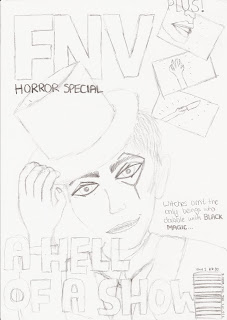
From that AS course I remember the conventions of a typical magazine, for instance, the title being large and in the top left corner of the cover. The title I thought up for out film magazine is an acronym; FNV (film and video). The main image may overlap the title, and can have either direct or indirect mode of a address depending the image being showed. Our main image is of course the magician, and because he is meant to terrify the reader we are giving him direct mode of a address so that he will be looking the readers in the eye for creepy effect. He will be striking a pose - holding his top hat in a tilt and grinning manically - to show the reader that he is eccentric.
Another convention of a magazine is that the headline for the main image is large and bold so that it stands out to the reader. Our headline will be "A Hell of a Show", playing on the fact that each of the magicians private performances inevitably leaves a young girl dead, and so is Hellish. A further subheading will read: "Witches aren't the only beings who dabble in Black Magic..." The title of the film is in bold to tell the readers that this is important. The ellipsis invites the reader to open the magazine and continue reading, which invokes their interest in the film as well as to buy the magazine.
Our film magazine will be a horror special, and so the images for the other films featured in the magazine will be of the horror genre. I drew a hand reaching upwards from the ground, a woman's mouth screaming and someone holding a knife. This gives the magazine realism and also is conventional as most film magazines do have images and subheadings for the other film featured and not just for the main image. I drew a bar code in the right hand side bottom corner of the magazine with the price (£3.50), date and issue number (1) at the top of it. This is also conventional to all magazines. I didn't add colour to this draft, but I can say that the colours we will be sticking to is red, white and black which is conventional to film magazines. The background will be black and smoky for a mysterious, ghostly effect to suit the horror special.
We wanted to keep the film poster simple to relate to the simplicity of the trailer itself. Therefore, there will only be two images on the poster - half of the magicians face on the left, with direct mode of address and a creepy smile to frighten the people looking at it, and an image of the girl tied up on a chair in the distance to give an idea to the audience of his torture techniques. The background will be much like that of the film magazine cover - black and smoky for a dark, mysterious effect that also reflects the trailer itself. At the bottom of the poster it reads "Black Magic" and as the top there is the tagline of "The performance of your LIFE..."
Magazine:
 Poster:

From that AS course I remember the conventions of a typical magazine, for instance, the title being large and in the top left corner of the cover. The title I thought up for out film magazine is an acronym; FNV (film and video). The main image may overlap the title, and can have either direct or indirect mode of a address depending the image being showed. Our main image is of course the magician, and because he is meant to terrify the reader we are giving him direct mode of a address so that he will be looking the readers in the eye for creepy effect. He will be striking a pose - holding his top hat in a tilt and grinning manically - to show the reader that he is eccentric.
Another convention of a magazine is that the headline for the main image is large and bold so that it stands out to the reader. Our headline will be "A Hell of a Show", playing on the fact that each of the magicians private performances inevitably leaves a young girl dead, and so is Hellish. A further subheading will read: "Witches aren't the only beings who dabble in Black Magic..." The title of the film is in bold to tell the readers that this is important. The ellipsis invites the reader to open the magazine and continue reading, which invokes their interest in the film as well as to buy the magazine.
Our film magazine will be a horror special, and so the images for the other films featured in the magazine will be of the horror genre. I drew a hand reaching upwards from the ground, a woman's mouth screaming and someone holding a knife. This gives the magazine realism and also is conventional as most film magazines do have images and subheadings for the other film featured and not just for the main image. I drew a bar code in the right hand side bottom corner of the magazine with the price (£3.50), date and issue number (1) at the top of it. This is also conventional to all magazines. I didn't add colour to this draft, but I can say that the colours we will be sticking to is red, white and black which is conventional to film magazines. The background will be black and smoky for a mysterious, ghostly effect to suit the horror special.
We wanted to keep the film poster simple to relate to the simplicity of the trailer itself. Therefore, there will only be two images on the poster - half of the magicians face on the left, with direct mode of address and a creepy smile to frighten the people looking at it, and an image of the girl tied up on a chair in the distance to give an idea to the audience of his torture techniques. The background will be much like that of the film magazine cover - black and smoky for a dark, mysterious effect that also reflects the trailer itself. At the bottom of the poster it reads "Black Magic" and as the top there is the tagline of "The performance of your LIFE..."
Magazine:


Subscribe to:
Comments (Atom)