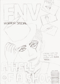
We were asked in this lesson to begin drawing out drafts of what we would expect our film poster and magazine cover to look like. Part of this task required knowledge from AS Media, from when we created music magazines.
From that AS course I remember the conventions of a typical magazine, for instance, the title being large and in the top left corner of the cover. The title I thought up for out film magazine is an acronym; FNV (film and video). The main image may overlap the title, and can have either direct or indirect mode of a address depending the image being showed. Our main image is of course the magician, and because he is meant to terrify the reader we are giving him direct mode of a address so that he will be looking the readers in the eye for creepy effect. He will be striking a pose - holding his top hat in a tilt and grinning manically - to show the reader that he is eccentric.
Another convention of a magazine is that the headline for the main image is large and bold so that it stands out to the reader. Our headline will be "A Hell of a Show", playing on the fact that each of the magicians private performances inevitably leaves a young girl dead, and so is Hellish. A further subheading will read: "Witches aren't the only beings who dabble in Black Magic..." The title of the film is in bold to tell the readers that this is important. The ellipsis invites the reader to open the magazine and continue reading, which invokes their interest in the film as well as to buy the magazine.
Our film magazine will be a horror special, and so the images for the other films featured in the magazine will be of the horror genre. I drew a hand reaching upwards from the ground, a woman's mouth screaming and someone holding a knife. This gives the magazine realism and also is conventional as most film magazines do have images and subheadings for the other film featured and not just for the main image. I drew a bar code in the right hand side bottom corner of the magazine with the price (£3.50), date and issue number (1) at the top of it. This is also conventional to all magazines. I didn't add colour to this draft, but I can say that the colours we will be sticking to is red, white and black which is conventional to film magazines. The background will be black and smoky for a mysterious, ghostly effect to suit the horror special.
We wanted to keep the film poster simple to relate to the simplicity of the trailer itself. Therefore, there will only be two images on the poster - half of the magicians face on the left, with direct mode of address and a creepy smile to frighten the people looking at it, and an image of the girl tied up on a chair in the distance to give an idea to the audience of his torture techniques. The background will be much like that of the film magazine cover - black and smoky for a dark, mysterious effect that also reflects the trailer itself. At the bottom of the poster it reads "Black Magic" and as the top there is the tagline of "The performance of your LIFE..."
Magazine:
Poster:


No comments:
Post a Comment