On the 13th of December, after school, Daniel and I stayed behind to film some test footage of the D.T. room and the English corridor so that we had an idea of how we could film and where actors needed to be positioned for the best results. We found that the D.T. room was the perfect place to film the Girl scenes, as it had big industrial doors and looked like an abandoned warehouse or factory of some sort - the kind of effect we wanted for these scenes. We were pleased to see that there was a place where the Girl could be positioned where, when the doors were slid back, a crack of light would illuminate half her face, as specified in the storyboard. There was also a good section of the ceiling where we could tape a torch for the effect of a swinging light bulb. With all of this in mind Daniel began to take pictures for reference, such as the clothes I would be wearing, where the stool and torch would be placed, the doors... he then filmed me opening the doors and the effect that they create of my face when I am sat on the stool.
On the 15th we began to look at film posters and film magazine covers to help us to create our own. As a class we criticized each others drawn out drafts and left post-its with good and bad feedback so that we can work on them and meet specifications. We received all good feedback from our film magazine cover with no areas where we needed to improve which pleased us and our teacher. However there were a couple of things that needed improving on for our film poster - it needed an age rating, producer information, newspaper reviews and when it is coming out to appear on it. So I made these changes swiftly; remembering my target audience being 15-25+, I put the age rating as a 15. I then added 'coming soon' and 'from the producers of...' on it and made up some reviews from The Times newspaper and Total Film magazine.
After this exercise we looked at some professional film posters and magazine covers. The posters were for "McGruber", "Crazy Heart" and "Never Let Me Go". We analysed them as a class, noticing that "McGruber" was an action comedy as there was a rather large explosion in the background and each character had a mock 'serious' face. The title suggested that the film was a spoof of well-known action programme "McGyver", and spoofs tend to try and be funny. We said that "Crazy Heart" was probably a feel good country and western themed film about a man and his love for music, as there was an old man with a guitar and the font for the title was in a font that if often used on Cowboy films. Therefore the film had no age rating on the poster as it wouldn't appeal to a younger audience anyway. "Never Let Me Go" had the appearance of a romance film as the colours were all black, red and white which is conventional of this style of film. Keira Knightly's award was advertised under her name on the cover to show people that she is a very good actress, therefore this is a serious film with good acting involved. We knew that it wasn't a Romantic Comedy, as there were no smiles or laughing on the cover. All characters looked either serious or sad.
We looked at some issues of Total Film and Empire. We saw how each main image was central and mostly had direct mode of address. The conventions of the magazine were sometimes subverted in order to fit with the genre of the film in the main image, for example, when 'Inception' was the main image, the subtitles and surrounding text was given the effect of being sucked into the centre of the magazine. The conventional colours seemed to be red, white and black with the occasional blue. The title of the magazine is always in the top left corner and the bar code in the bottom right corner.
When school had finished, Daniel and I came back at around 5 'o' clock to begin some filming. I got changed into the clothes of my character - baggy, scruffy jeans and a plain white t-shirt - and put on some eye liner and mascara to smudge down my face to give the effect that I have been crying. I then back combed my hair to make it look incredibly messy. We went to the D.T. room and my feet were duck taped to a stool that I was sat on, and some duck tape was placed around my mouth to be used as the gag. I was the Girl, and ready to be filmed. Some string was placed on our torch which was then taped above my head but out of shot so that it looked like a swinging light bulb above me. Daniel used his camera to film me acting distraught with the help of extra lighting from Russell Shaw and Ashley Pitt who used other torches and their phones. Daniel filmed a close up, mid shot, long shot, high angle shot and panning shot using a trolley. All these shots were repeated at least twice so that when it comes to editing, we can pick the best take. After these shots were done, we went to the English corridor to do some test footage how to film the Magician walking using Russell Shaw's feet as our real actor was unavailable. We realised that a skateboard would need to be used to give the effect that the camera is following the Magicians feet, otherwise the camera is too shaky and it looks unprofessional.
On the 16th Dec, we filmed some of the Magicians scenes before our classes begun. Because we only had a top hat and blazer available at this time, we said that this would simply be test footage. We only filmed Scott as the Magician opening the big industrial doors. We filmed his face in a close up and then a mid shot from the back so that we didn't get any incorrect mise-en-scene into the frame.
Thursday, 15 December 2011
Thursday, 8 December 2011
Filming Schedule - 08/12/11
We would be starting to film our trailer very soon and so we decided to create a 'filming schedule' in order for us to film efficiently. Daniel and I decided that every time we finished part of the schedule, we would tick off that part, so that we didn't waste any time going over things we had already done. Our schedule was simple and easy to understand, and was as follows:
Actors: Scott Isle - the magician
Melissa Hollingworth - the girl/victim
9th Dec: Ask permission from Mr Blackett or Mr Bulmer to film in the D.T. area of school. Gather all props
needed for next week; chair/stool, duck tape, torch, string, eye liner/mascara.
12th - 16th Dec: Start filming after school at around 4-5pm. Take reference pictures and test out the English
corridor to see if it is the correct location to film for the Magicians scenes.
January: Gather all props needed throughout January; top hat, suit. Take pictures of both the Girl and the
Magician for poster/magazine cover. Film the Magicians scenes. Editing - sound effects, voice
overs, fitting the clips together.
Due to exams we cannot film on the 12th, 13th, 19th, 20th, 23rd, 24th or 25th of January.
Our actor and some of our props have changed as we realised that some things weren't available and our actor dropped out. We replaced Thomas Webster with Scott Isle and ditched the idea of using a cane as it was impossible to find one that we would be allowed to use on such a small budget.
Thursday, 1 December 2011
Drafting our Poster and Magazine Cover - 01/12/11
We were asked in this lesson to begin drawing out drafts of what we would expect our film poster and magazine cover to look like. Part of this task required knowledge from AS Media, from when we created music magazines.
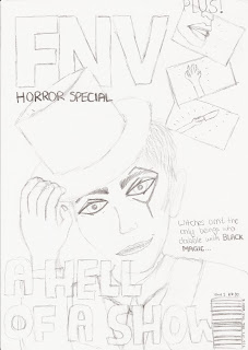
From that AS course I remember the conventions of a typical magazine, for instance, the title being large and in the top left corner of the cover. The title I thought up for out film magazine is an acronym; FNV (film and video). The main image may overlap the title, and can have either direct or indirect mode of a address depending the image being showed. Our main image is of course the magician, and because he is meant to terrify the reader we are giving him direct mode of a address so that he will be looking the readers in the eye for creepy effect. He will be striking a pose - holding his top hat in a tilt and grinning manically - to show the reader that he is eccentric.
Another convention of a magazine is that the headline for the main image is large and bold so that it stands out to the reader. Our headline will be "A Hell of a Show", playing on the fact that each of the magicians private performances inevitably leaves a young girl dead, and so is Hellish. A further subheading will read: "Witches aren't the only beings who dabble in Black Magic..." The title of the film is in bold to tell the readers that this is important. The ellipsis invites the reader to open the magazine and continue reading, which invokes their interest in the film as well as to buy the magazine.
Our film magazine will be a horror special, and so the images for the other films featured in the magazine will be of the horror genre. I drew a hand reaching upwards from the ground, a woman's mouth screaming and someone holding a knife. This gives the magazine realism and also is conventional as most film magazines do have images and subheadings for the other film featured and not just for the main image. I drew a bar code in the right hand side bottom corner of the magazine with the price (£3.50), date and issue number (1) at the top of it. This is also conventional to all magazines. I didn't add colour to this draft, but I can say that the colours we will be sticking to is red, white and black which is conventional to film magazines. The background will be black and smoky for a mysterious, ghostly effect to suit the horror special.
We wanted to keep the film poster simple to relate to the simplicity of the trailer itself. Therefore, there will only be two images on the poster - half of the magicians face on the left, with direct mode of address and a creepy smile to frighten the people looking at it, and an image of the girl tied up on a chair in the distance to give an idea to the audience of his torture techniques. The background will be much like that of the film magazine cover - black and smoky for a dark, mysterious effect that also reflects the trailer itself. At the bottom of the poster it reads "Black Magic" and as the top there is the tagline of "The performance of your LIFE..."
Magazine:
 Poster:

From that AS course I remember the conventions of a typical magazine, for instance, the title being large and in the top left corner of the cover. The title I thought up for out film magazine is an acronym; FNV (film and video). The main image may overlap the title, and can have either direct or indirect mode of a address depending the image being showed. Our main image is of course the magician, and because he is meant to terrify the reader we are giving him direct mode of a address so that he will be looking the readers in the eye for creepy effect. He will be striking a pose - holding his top hat in a tilt and grinning manically - to show the reader that he is eccentric.
Another convention of a magazine is that the headline for the main image is large and bold so that it stands out to the reader. Our headline will be "A Hell of a Show", playing on the fact that each of the magicians private performances inevitably leaves a young girl dead, and so is Hellish. A further subheading will read: "Witches aren't the only beings who dabble in Black Magic..." The title of the film is in bold to tell the readers that this is important. The ellipsis invites the reader to open the magazine and continue reading, which invokes their interest in the film as well as to buy the magazine.
Our film magazine will be a horror special, and so the images for the other films featured in the magazine will be of the horror genre. I drew a hand reaching upwards from the ground, a woman's mouth screaming and someone holding a knife. This gives the magazine realism and also is conventional as most film magazines do have images and subheadings for the other film featured and not just for the main image. I drew a bar code in the right hand side bottom corner of the magazine with the price (£3.50), date and issue number (1) at the top of it. This is also conventional to all magazines. I didn't add colour to this draft, but I can say that the colours we will be sticking to is red, white and black which is conventional to film magazines. The background will be black and smoky for a mysterious, ghostly effect to suit the horror special.
We wanted to keep the film poster simple to relate to the simplicity of the trailer itself. Therefore, there will only be two images on the poster - half of the magicians face on the left, with direct mode of address and a creepy smile to frighten the people looking at it, and an image of the girl tied up on a chair in the distance to give an idea to the audience of his torture techniques. The background will be much like that of the film magazine cover - black and smoky for a dark, mysterious effect that also reflects the trailer itself. At the bottom of the poster it reads "Black Magic" and as the top there is the tagline of "The performance of your LIFE..."
Magazine:


Thursday, 24 November 2011
Focus Group Script - 24/11/11
To help us to understand what our target audience would like to see in our film and whether or not our product is good, we were asked to create a focus group of a few people who fit our target audience. We would then show them our storyboard and tell them our ideas whilst being recorded, then ask them questions surrounding our product. We can then take in their comments and advice and use this feedback to better our product. Our focus group must contain mostly boys as our target audience is mostly male. These boys must be within the age range of 15-25+ and enjoy horror/thriller themes.
UPDATE: 02/03/12
After recording our focus group, issues arose and we needed to transfer our project to a different location. During this process, the audio file for the focus group was lost and is irretrievable. However, to help us with audience feedback, we had written a transcript during the recording. What Daniel and I said is in bold:
Daniel: For our A2 production we are going to do a film trailer in the horror genre, but with a slasher sub-genre in mind. We have got a group of people here to present our ideas to.
Melissa: Our film trailer will be advertising a new slasher horror film named "Black Magic". The storyline of our film is that a failed magician is on a hunt to find the perfect glamourous assistant but kills each girl in the process. First of all, can I ask you if you like the horror genre?
Barney: Yeah, I watch them on a regular basis.
Luke: It's my favourite film genre.
Jodie: I wouldn't normally watch them, but I have enjoyed the one's that I have seen.
Scott: Yeah, I watch them.
Daniel: We've got a storyboard here to present to you to give you an idea of how the final piece is going to look.
Melissa: From looking at our storyboard, what are your initial thoughts on our film trailer?
Jodie: It looks a bit like a psychological style film.
Barney: I can imagine it as a real film, I like the idea.
Scott: I like the 'quick scare' at the end, it would probably make me jump.
Luke: It looks intruiging.
Daniel: Would you be interested in seeing this film in the cinemas?
Luke: Yes, definitely.
Scott: Probably.
Barney: I would give it a go.
Jodie: I'm not sure. It looks good but I'm just not in to horror.
Melissa: From hearing our pitch and seeing our storyboard, what do you think to our overall idea?
Scott: I do like it, it looks eerie.
Luke: It will be different, the magician idea is unique.
Jodie: It looks like a real trailer so yeah.
Barney: Maybe there should be more magician style objects within the trailer, like a box that he uses in his acts and things.
Daniel: What improvements would you suggest to make the final production better?
Jodie: Like what Barney just said, add more of a magician feel.
Barney: Yeah.
Luke: I like it but not the way the title screen font is, with the lightbulbs. It needs to look scarier, less glamourous.
Scott: I like it all, I'm not sure what to say to that question.
Melissa: Thank you for taking part.
Thursday, 17 November 2011
Theories - 17/11/11
In today's lesson we learnt about several different theories that people have had about the media since it's birth. Knowing about these theories gives us a better understanding of media and how it works, and will help us when we create our own product. These theories are known as Hypodermic Needle Theory, Two Step Flow, Uses and Gratifications Theory, Reception Theory and finally the theory of Vladimir Propp.
Hypodermic Needle Theory 1920's: a crude theory depicted during the first two decades of mass media suggesting that the information from a text passes into the mass conscious of the audience without them realising. This basically means that people watch/read media and it's 'injected' into their minds, and that's it - that's what they believe. No processing, no opinions, like zombies. It suggests that as an audience we are easily manipulated by the creators of media and directly influenced by this. It assumes that audiences are passive and heterogeneous. Governments used this theory in order to distribute propaganda. Parents and other adults still quote this theory today as they think that video games influence youths, for example, the boy who shot his parents after playing Call of Duty: Black Ops.
Two Step Flow 1955: Theorists Lazarfeld and Katz later decided that the Hypodermic Needle Theory was wrong as it didn't take into account the individuality of the audience. They realised that people receive information, process it and then take what they want from it using their own opinions. They said that there are two types of audience - the 'opinions leaders' who influence their own opinions about mass media and the people who are influenced by the opinion leaders and have the media filtered in their minds. Hitler was an opinion leader who influenced an entire army.
Uses and Gratifications Theory 1974: Theorists Blulmer and Katz decided that the audience has certain needs that the media for-fills. These 'jobs' that the media takes on then gratify the audience. The audience needs to be: Informed
Educated
Entertained
Able to identify with characters
Able to socially interact with others/discuss with them
Able to escape
Reception Theory 1980's-90's: This theory suggests that the media encodes their product and the audience subconsciously decodes it. People decode the product differently which leads to different interpretations. When a media product sticks to conventions, it's called 'preferred reading'.
Vladimir Propp - This theorist said that every story we ever come across will have a basic set of elements. Within this theory he said that there are different character categories which are as follows:
Villain - the bad guy
Donor - someone who gives the hero something
Helper - someone who helps the hero, e.g. sidekick
Princess - the prize of the story, usually a girl for the hero to love
Dispatcher - the one who gives the hero his mission
Hero - the good guy
False hero - the one who almost gets the Princess, sometimes the villain too
Theorists Strauss and Bathes used Propps theory for their own ideas.
Wednesday, 9 November 2011
Presentation, Representation, Narrative Todorov's Theory - 09/11/11
The presentations that we created last time were not up to the standard that our teacher was happy with, and so she gave us a guide on how to make perfect presentations and how to present that in a good way. Using this feedback, we created new presentations that featured examples of horror trailers and whether or not our trailer will conform or subvert the codes and conventions from the last presentation we made. There were six slides to this presentation including a title page once again.
On the second slide, I made a bullet point list of the typical conventions within a trailer just to recap, and then used this bullet points to explain around when presenting instead of just reading off the slide like last time. These bullet points were as follows:
Dim lighting
Music
Voice over
Content
I explained once again how there is usually little or no lighting within a horror trailer as it adds to the fear of the unknown, how there is no music in modern trailers but eerie quiet music in the old ones, how there is usually no voice over in modern trailers but in the old ones there was usually a deep-pitched man speaking to act like the villain, and how the trailer never gives anything away but only showing the build up to important scenes and then cutting the actual action.
The next slide is where the examples began. My first example was The Saw Series. I placed a link to the trailer for the first Saw film which is also accessible here: http://www.youtube.com/watch?v=b1lgXhFbXy4 Embedding the link within my presentation meant that the class could watch it and then understand why I used it as an example and the different elements it has. I then bullet pointed the key features of the trailer that were conventional, which were that it had dim lighting, little content, no music and no voice over. I talked around these points to give the class true detail, such as the reasons why these conventions were kept and what effect they give.
The second example on slide three was of The Nightmare on Elm Street Series, the trailer to the 2010 version of the first film being here: http://www.youtube.com/watch?v=2SulpWn6Glk&feature=related I bullet pointed similar conventions such as the dim lighting, little content and no voice over but there was also a new element to this trailer - a chilling child-song. This famous song sung by small children is conventional of older trailers from around the same era as the original Nightmare on Elm Street film. It's the typical eerie and quiet music, only expressed as a nursery rhyme to create a more spine-tingling atmosphere, and is quite original and unique, as if the creators of this film trailer may have subverted to the conventions of trailers at that time.
The third example I used was Texas Chainsaw Massacre, linked up here: http://www.youtube.com/watch?v=Mra_Z3cpGCM I noted with this trailer that as well as the typical dim lighting and lack of voice over, it also has very dramatic music throughout which gives the audience a sense that there will be a lot of action in this film. The trailer also contrasts from beginning to end - at the start, there are a few happy young people laughing and enjoying themselves on a drive. At the end, they're bloody and terrified of something that's coming after them. This shows the audience how realistic it could be, that even when it's sunny and everyone's having fun, danger can attack from anywhere. This would scare the audience more than the conventional ways would, as it means that they're never safe.
Our final slide pin pointed how our trailer will mostly conform to the codes and conventions of horror trailers, as we will have dim lighting, eerie music called "The Sound of Silence" that eventually gets heavier, no voice over and the stereotypical male villain and female victim. The only way in which our trailer subverts conventions is that in horror trailers - in fact, in any genre of trailer - it usually shows the best bits of the film in a short compilation. Our trailer, however, will be one long sequence of an entire scene, with bits of it cut out so as not to spoil the action of the film.
In today's lesson we also learnt about representation, narrative and Todorov's theory.
Representation
This is how characters and ideas are put across in media. Using our idea for our A2 horror film trailer product, we created a mind map about representation:
Identification of Characters: magician is a psychopath, insane, put across by how he acts and what he does. The girl is the victim and is vulnerable, so her clothes will be torn and face dirty, tears on face constantly.
Representational Concepts: gender is stereotypically used within our film trailer; a dark, domineering, powerful man attacking a vulnerable, young, beautiful girl. This links into Stereotypical Representations.
Elements: the magician has a vacant yet focussed facial expression and looks directly at what he desires, e.g. the girl. He wears formal, conventional magicians clothing e.g. a suit, top hat and cane. He will act ecstatic and creepy. The girl has a terrified facial expression throughout and her eyes flutter about glancing around. She wears torn casual clothes. She will scream and act scared and worried.
Other Representations: the setting will be a long dark corridor, and a dusty dark room. The location will be an abandoned looking area, isolated and deathly.
Conform/Subvert?: We do conform to the idea of a magician in a suit and top hat, and the to girl having torn clothes and a dirty bloody face, and their gender roles in the film. This is all very conventional of typical horror films, therefore nothing has been subverted.
Narrative
This is the way in which the trailer has been structured and the storyline behind it. We once again used our idea for our A2 horror film trailer product to create another mind map.
Narrative Structure: a crazy magician kills girls whilst searching for the perfect glamorous assistant.
Narrative Techniques: mystery - you don't see much of the antagonist. Lingering shots that build tension for the audience.
Establishment: we have an antagonist and a back story to go with him, lot's of vulnerable female victims and conventional settings such as dark nights and rainy weather.
Adhere/subvert: we do adhere to the narrative conventions of horror/slasher trailers.
Todorov's Theory
Todorov said that all stories you come across have the same five stages which are equilibrium, disruption, recognition of disruption, attempt to repair disruption and reinstatement of equilibrium. In more detail:
Equilibrium: setting is established, key characters are introduced, storyline is set up.
Disruption: oppositional character(s) appear and the story takes particular direction.
Recognition of disruption: lives of characters and events interweave, tension builds (often longest section)
Attempt to repair disruption: highest point of tension - change in dynamic after this
Reinstatement of equilibrium: matters are sorted out, problems are solved, questions answered.
Thursday, 3 November 2011
Presentation on Conventions of Horror Trailers - 03/11/11
We were asked previous to today's lesson to create a Power Point Presentation on the codes and conventions of horror trailers, which would help us to improve our understanding on how they are created and how we need to make our trailers. My presentation had five slides in total including the title page.
Slide two was about the music within horror trailers. I explained how it is one of the main elements of old horror trailers as it sets the atmosphere for what the film is going to be about and creates the right amount of tension depending on the content of the film itself. I pointed out how it is usually an eerie noise, maybe starting off quiet and slow but eventually building up into a big noise. This could lead to a sudden silence to invoke more tension and fear into the audience. Most modern horror trailers don't have any music at all during the trailer, as for some people, utter silence is the worst sound of all, therefore it would be playing on the audience's fears.
The next slide was about the voice over featured within a horror trailer. I outlined how the voice over must be deep, creepy or lingering to make the effect of it being the villain who is speaking. Short, snappy sentences leaves the audience with a lack of detail, making them want to learn more and therefore watch the film. In a lot of modern horror trailers there is no voice over, which makes the trailer seem more real and suspense-filled.
The next slide indicated the importance of what content is used within the genre of horror trailers. I explained how showing very little of the film or the gore/scares builds a fear of the unknown for the audience and also intrigues them into watching the film. For example, is a lot of trailers we would see something like: a man approaching a women with a knife, lifting it, and perhaps lunging towards it... but this would be where the scene would cut and the audience wouldn't know whether or not he actually stabs her or whether she escapes this fate. They must watch the film in order to gain this information.
My final slide was about lighting within a horror trailer - this seems quite obvious to most that there would be little or no lighting as most horror films like to play on the most common fear of all - fear of the dark! Nyctophobia is not actually the fear of the dark itself, but a fear of what could be hiding or lurking in the darkness, therefore this link in with the fear of the unknown. People feel safer in familiarity which is why we prefer to be in the light, where we can see our surroundings. Thus, setting a horror film and it's trailer in dark surroundings where it is difficult to see what is there would definitely access this fear in most of the audiences minds.
I uploaded this presentation onto Slide Share and have embedded it here:
<div style="width:425px" id="__ss_12799462"> <strong style="display:block;margin:12px 0 4px"><a href="http://www.slideshare.net/MelissaLeah/research-of-horror-trailers" title="Research of horror trailers" target="_blank">Research of horror trailers</a></strong> <iframe src="http://www.slideshare.net/slideshow/embed_code/12799462" width="425" height="355" frameborder="0" marginwidth="0" marginheight="0" scrolling="no"></iframe> <div style="padding:5px 0 12px"> View more <a href="http://www.slideshare.net/thecroaker/death-by-powerpoint" target="_blank">PowerPoint</a> from <a href="http://www.slideshare.net/MelissaLeah" target="_blank">MelissaLeah</a> </div> </div>
Thursday, 22 September 2011
Storyboard - 22/09/11
In today's lesson me and Daniel began to create a written storyboard to show what will happen in our trailer so that we can later show this to our focus group and get a good response from them. To do this, however, we first needed to say what props, actors and music we would need, as well as what the title of the film will be. We decided that the music could be "The Sound of Silence" that we will need the permission of - we will email the creators and ask if we can use their music for our trailer. We decided that the props we would need are as follows:
Top hat
Tuxedo/suit
White gloves
Cane
Gag
Rope
Chair
We then picked actors to feature in our trailer. There will only be two characters. I will be playing the victim, and Tom Webster will be playing the magician. The title of our film is "Black Magic". Our storyboard is as follows:
-Static sound fades into 'The Sound of Silence', we see a hallway. It's dimly lit and the camera is moving down it as if someone is walking and we are seeing from their point of view.
- Cuts: we are now in a dark, claustrophobic space. It is just possible to see that there is a girl gagged and tied to a chair. She looks terrified.
- Back to the hallway. We can now here footsteps and whistling to the music.
- We see the lower body of a well dressed man, the one who's whistling, carrying a cane and swinging it as he walks with a spring in his step.
- Now we can only see his eyes. He has strange markings over one eye, and a vacant yet focussed look.
- Cuts: the girl has begun to struggle now, becoming manic, we can hear her muffled moans.
- Now we can only see the man's mouth. He's smirking. We faintly hear him whisper "prepare to be amazed".
- Back to the girl: a crack of light illuminates one side of her face, as though a door has opened, and she stops struggling. Tears cloud her eyes.
- We see the man standing in the doorway, leaning on his cane (from behind). He puts on white gloves as she muffles another scream.
- Cuts: black screen, with the words "black magic" written across it.
- Cuts: the white glove thrown onto the floor, covered in blood, we can hear muffled whimpers from the girl.
- Cuts: black screen, with the words "coming soon" written across it.
- Now for the last quick scare: the camera is on the floor, the girl falls and fills it with her dead, bloody face.
I later drew up this storyboard in pencil for the focus group later in the year:


We discussed the setting of our trailer in great detail and length. At first, we were struggling to find anywhere that would look abandoned, and even when we were encouraged to use the stage at school as the room where the girl is, we were still finding it difficult to find a decent hallway to film in. Finally, it was suggested to us that we could use a corridor in school as long as we made it look abandoned by putting cardboard and leaves on the floor.
Thursday, 15 September 2011
Planning our product - 15/09/11
I apologise for the lateness of my blogging. There were technical difficulties at my sixth form college that resulted in the loss of computers and internet for the duration of September, October and partially November.
I am working on my A2 media coursework with Daniel Stockton. We had to choose what product we wanted to create and then begin planning our ideas.
Our first idea was to create a short film which would also require a film poster and review. It was called "The 14th Day" and was about a zombie apocalypse, as a result of a virus outbreak, and a group of teens attempting to survive. However we soon realised that we would need too many actors, special effects and it would be very complicated to edit so we changed our product completely.
Our new task is to create a film trailer, film magazine cover featuring our film and a poster for the film. To start with, we began planning what genre our film will be, and what would happen in it.
We decided to make the genre of our film trailer as 'horror' with the sub-genre being 'slasher'. A slasher film is one that involves a lot of blood, gore and violence and no supernatural or mysterious events - it is usually very close to reality. Before we could decide what would go in the trailer, we had to think up of an entire film so that the trailer will seem more real. We thought up a storyline: a failed magician killed his assistant a long time ago and it caused him to lose his mind, therefore he now scours the country searching for the perfect assistant to accompany him with his act. However, his deranged mind means that he begins to kill each girl, usually in an ironic circumstance such as sawing them in half in a box or throwing knives at them whilst they spin on a giant wheel. Eventually one girl manages to escape, the protagonist, and alerts the authorities so that a chase begins and the magician is caught.
We then created a target audience profile so that we can aim our trailer at a certain type of person that would normally go for this kind of film. This is the profile that we came up with:
Gender: Male
Age: 15-25+ (it's too gory for a young audience - moderate profanities also featured)
Interests: Horror/thriller
As a class we analysed film trailers to give us more of an understanding into how they work. We watched the trailer for 'The A Team" and were given the task of naming the camera angles featured, the content and the genre. We decided that "The A Team" was created for a predominately male audience who enjoy plenty of action, violence and one-liner humour. There were many gun fights, explosions and funny lines within the trailer which is why we came up with this profile. We also noted how the trailer was represented as an action film - it was fast paced, featured lots of explosions, guns and fights, one-liners, close-ups and the music was fast-paced and loud.
Subscribe to:
Comments (Atom)